
Three Essential Elements of Visual Advertising
In this article, we explore the decisions and techniques that lie behind three essential elements of visual advertising: composition, rhythm and colour. And consider why they need to be in your design toolbox.
1. Composition
Unlike colour, the effects of good composition usually operate under the radar of the audience – only when it is done badly, does composition evoke a conscious response.
Yet composition emerged from the shadows last month, taking centre stage in a debate about the release of a photo of the then Conservative leadership candidate Boris Johnson and his girlfriend Carrie Symonds sitting in the English countryside.

The timing of the publication of the photo was convenient – it drew the headlines away from the couple’s late-night argument to which police were called. Twitter was alight with complaints about the photo’s obvious “plant” – much of the evidence for which focused on the composition of the photo.
Professional photographers were quick to point out the composition followed designer tricks such as “rule of thirds” and the highlight of a high-impact contrast colour. Carrie sat on a red cushion exactly two thirds across the photo – a sure sign of a professional at work, so said Twitter.
Whether or not this evidence stacks up or proves anything conclusively, the debate does highlight the need for a strong focal point in any composition.
The rule of thirds is a technique that helps to draw the audience’s eye across an image or advertisement. It adds interest and provides balance while avoiding that “plonked in the middle” look.

It works by dividing the page into a grid based on three equally spaced horizontal lines and three equally spaced vertical lines. The focus of your composition is placed where the lines meet. When you start analysing the rule of thirds, non-designers may be surprised how universally it is applied.

An alternative to the rule of thirds is another shape that designers love to use: the Fibonacci spiral.
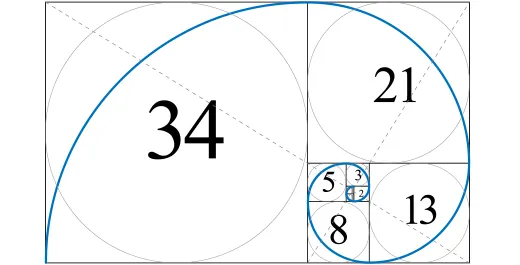
The Fibonacci spiral is based on the work of Leonardo of Pisa in thirteenth-century Italy; he developed a sequence of numbers that reflects the pattern of growth spirals found in nature. It works on a ratio of 1: 0.618 (as used in the BP helix logo).

Good composition doesn’t always follow these rules around thirds, however. Another high-impact technique is to direct the eye to the focus of your composition using leading lines. These lines can lead to different tiers or points of information.
This brings us to another important aspect to consider when building your composition: scale and hierarchy.
For web pages, this is usually an easier choice than in traditional advertising; there is an accepted hierarchy and scale which web users expect. Therefore, web designers need to conform to these expectations in order to aid navigation.
For designers working on off-line advertising projects, there is more freedom. Here, scale and hierarchy are all about making more important elements of your design bigger and bolder than the less important elements. Lesser elements can then be built in with plentiful “white space” in order to ensure your important elements have maximum impact.
2. Rhythm
Rhythm is all about the flow of images and information in your artwork or graphic design. Here, understanding how repetition can be used and played with helps to add impact.
Repetition is used extensively in design. It’s also important to help develop a clear brand identity – whether that is the repetition of a shape, a colour, or a particular font. Repetition from image to image works because we begin to recognise the signals for a brand – it helps to create and reinforce the brand identity.
This may work in a single image or over time in a series of ads or communications.
In website and app design, repetition is commonly used. For example, a logo will appear in the same place on every page or screen. In this case, repetition is used to create a consistent user experience.
Andy Warhol’s pop art images of Marilyn Monroe and his iconic tins of soup are perhaps the best illustration of the power of repetition.
Warhol’s ironic pop art held up a mirror to brand advertising and shone a light on how we are subjected – and prone – to this technique. There is no subtle persuasion here.
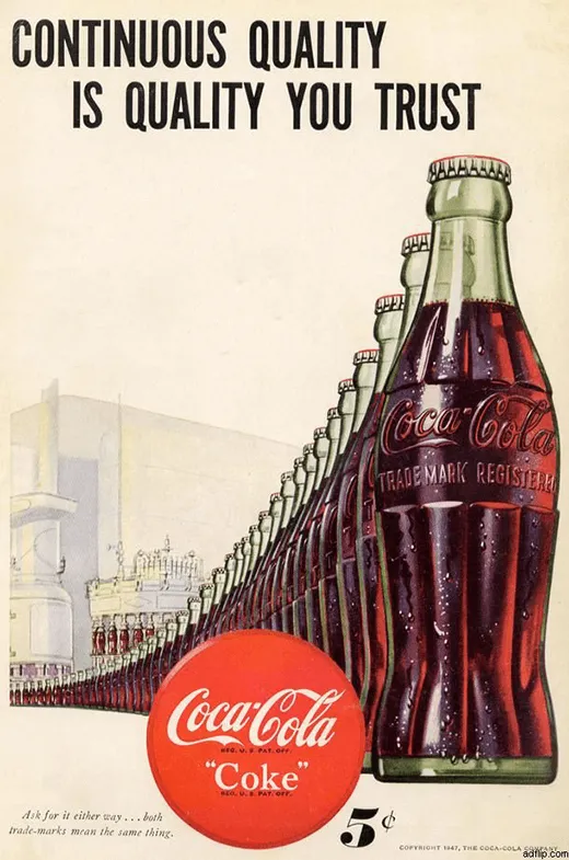
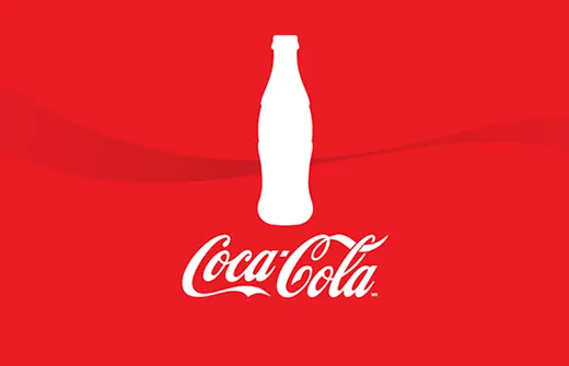
When repetition is used within an image, it also creates a feeling of consistency and quality. In the early Coca-Cola ad above, the bottles are lined up emerging straight from the production line – an advance from the variable product quality of the past or of other less automated producers.
Today, the ad seems curiously dated, reminiscent of something from the Soviet era or the work of Sergei Eisenstein. It is a far cry from the artisan, hand-made, hipster-curated search for novelty of modern consumer messaging.
Yet, despite Warhol’s treatment of the technique, modern advertising isn’t shy about continuing to appropriate it. Repetition is something Apple i-Pod advertising campaigns have used to great effect – and repeatedly. Its New York subway campaign (below) is a classic example.
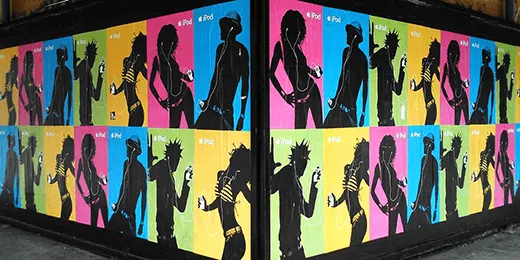
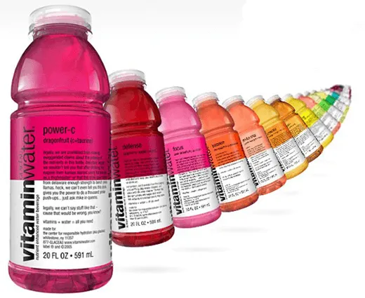
As well as being visually stunning, the use of repetition here is designed to illustrate the versatility and universality of the iPod, much in the same way it is used to emphasise all the different flavours in this ad.
Using repetition in this way can also help to create a sense of movement.
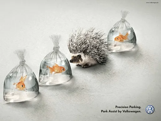
The eye is naturally drawn to irregular elements, which offers opportunities to add greater emphasis to one of the elements in your pattern – or to add humour, as with the Volkswagen advert above.
3. Colour
One of the reasons the Vitamin Water and i-Pod adverts work so well is they play with the cadence of their respective repetitions through the use of colour.
Colour is important for many reasons.
First, individual colours can evoke different emotions.

We’ve looked at the emotional power of colour in an earlier blog post, so we won’t repeat it here – read the blog in full if you want to know more. Just bear in mind that the emotional impact of a colour can be different between different nations and cultures. For example, the emotion evoked by the colour white here in the UK is very different to the emotion that colour evokes in India.
Second, colour can communicate brand identity.
The emotional power of individual colours and the complexity of global attitudes to colour is why brand consultants will spend a great deal of time choosing the colours that evoke the right emotions for a particular brand.
Once chosen, the continued use of the selected shades helps to create a consistent and recognisable brand identity.
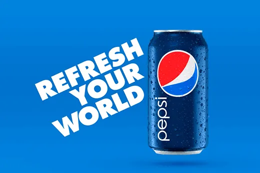
You can see this in the advertising of Coke and Pepsi, in particular.
And colour has more to offer than emotion and branding; it also adds impact.
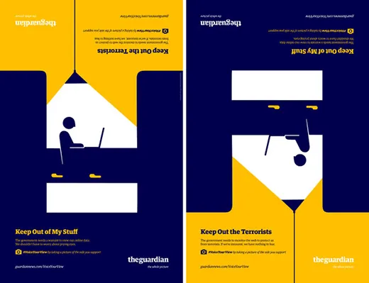
Contrasting two or three colours is a powerful way to grab attention, as this clever Guardian ad illustrates.
Perhaps most strikingly, how we choose to combine colours can also evoke very different messaging. In this way, colour is right at the heart of the choices a designer makes about their work.
While contrast is a powerful colour technique, it can be jarring – and isn’t right for all situations. Instead, saturating an image with complimentary colours can deliver a luxe and equally powerful result.
In Summary
These three design principles are essential; we see their effects all the time in advertising. Even so, a good designer can play with them to create new and exciting aesthetics.
Great design is a choice – often between competing but equally powerful rules. Deciding which approach is best for each brand and set of messaging is the magic of good design.
Extend your graphic design skills with us: www.platformtraining.com