Great Infographics
Infographics are a great way to get attention for your brand and drive visitors to your website. When done well, they are really shareable. And, as we travel down the seemingly inexorable road to visual content being king, they are the perfect response to the way we are today consuming data and information.
When you first start working on an infographic you realise what an incredible skill is involved in succinctly visually representing information in a way that both looks good and clearly communicates its meaning.
Luckily, there are plenty of great infographics around from which we can draw inspiration…
1. The Original and Still the Best
If one infographic has proved its worth over time, it has to be the London tube map. This iconic visual guide to London’s local subway network is visually stunning and communicates a vast amount of information in a clear way. The Londonist has a great article tracing its history.
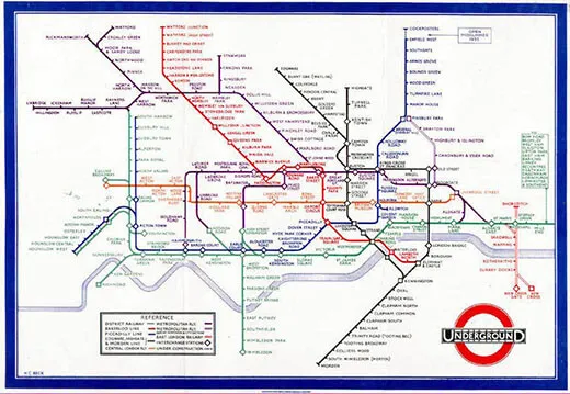
Why we love it? An iconic design that communicates a large amount of complex information very clearly.
2. Beautiful Design
If you want to see really beautiful examples of the visual presentation of data, you need to take a look at the work of London-based author and infographic artist David McCandless, over at Information is Beautiful.
He has produced more than two books worth of these beautifully simple infographics – all proving that, when it comes to infographics, you do not need to over-egg the pudding.
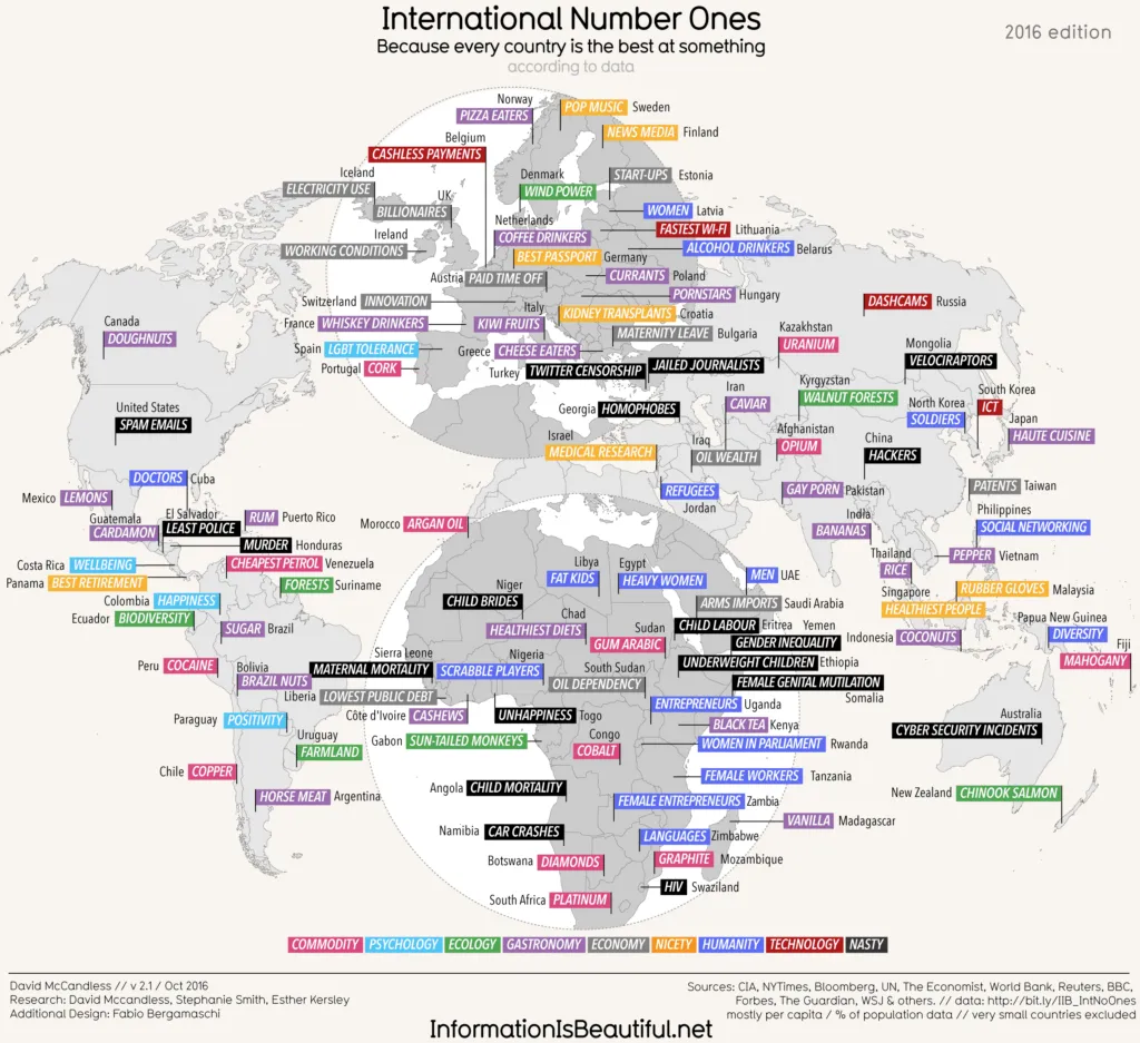
Find this map on the information is beautiful website.
Beautifully simple presentation of data becomes a work of art.
3. Get Your Facts Right
Don’t despair if you lack the graphic artistry of McCandless. Sometimes the graphics don’t have to be all that to communicate your message clearly and inject a bit of humour, which is why I love this infographic accompanying an article by The Atlantic author Megan McArdle in which she complains about the rise of the “fake news” infographic deliberately constructed to mislead.
It reminds me of the famous Albert Einstein quote “99% of what you read on the Internet is false”… Read the whole of Megan’s argument about why if you’re a would-be infographic designer you should fact check yourself.
And, while we’re on the subject, it’s also good practice to state your sources clearly at the bottom of the infographic.
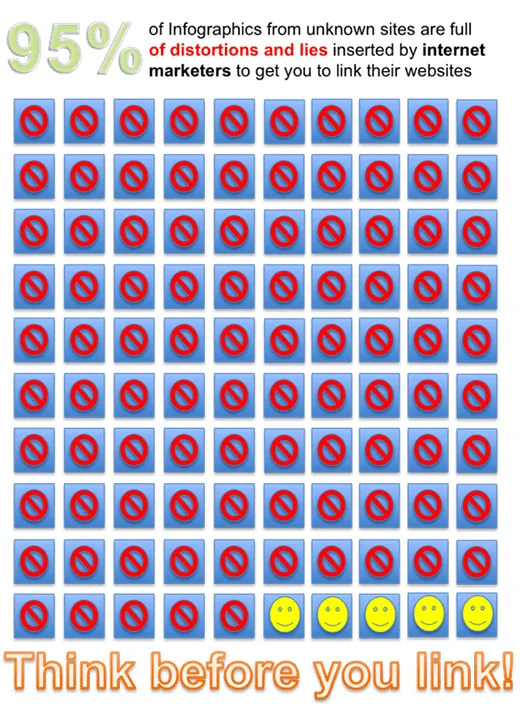
Why we love it? It is proof that you don’t have to be an artistic genius to get your point across.
4. Think Beyond Bar Charts
I love this use of pointillism to represent the nuances of a dataset. It illustrates that bar charts and pie charts are the only way to go. Thinking creatively and taking an unusual approach can lead to some beautifully simple ways to present complex or more nuanced datasets.
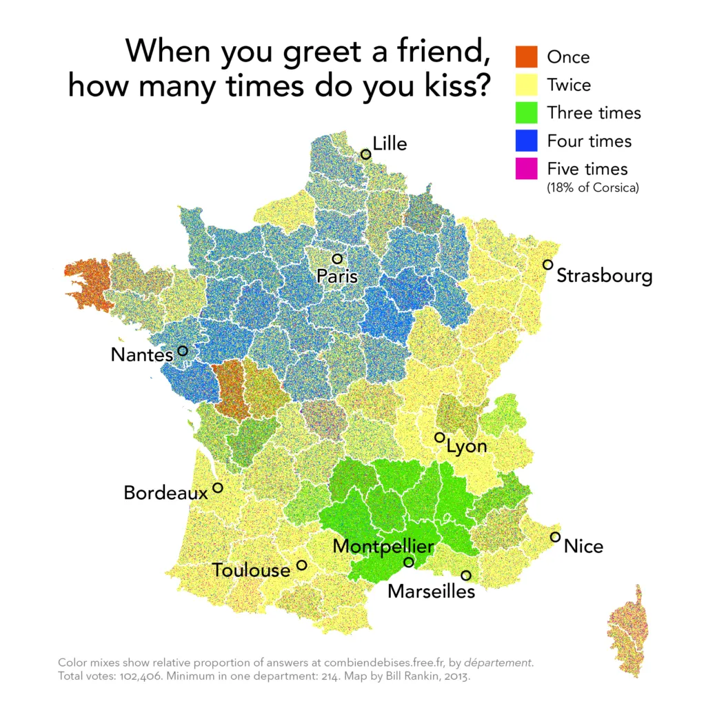
Why we love it? A classic art technique enables the data to be shown in greater depth.
5. Room for Sly Humour
You might reasonably describe this next set of images as diagrams rather than infographics, but since they do visually communicate information I guess infographic is as good a name as any… and I love the way this collection asks you whether you are really paying attention?
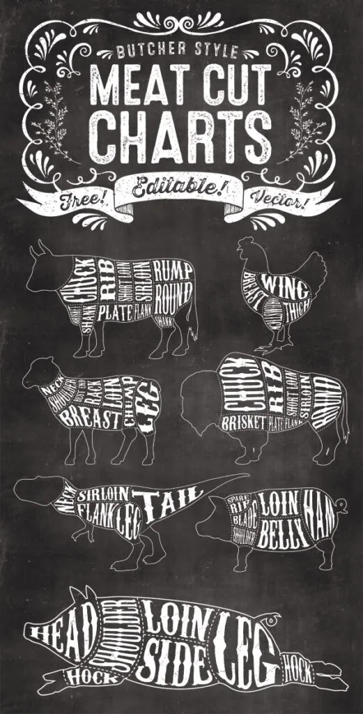
Why we love it? T-rex Sirloin anyone?
6. Scrolling Works Best on Mobile
Mobile overtook Desktop for the first time in the UK last year, which means that those interminable scrolling infographics are the way to go. Just make sure you pack them with enough succinct and relevant facts and keep them pretty enough that yours don’t seem interminable! And, as this example proves, parallax features and interactive elements are even better at holding interest.
Why we love it? Our brain craves infographics.
7. Sometimes You Can Get Away with a Lot of Text
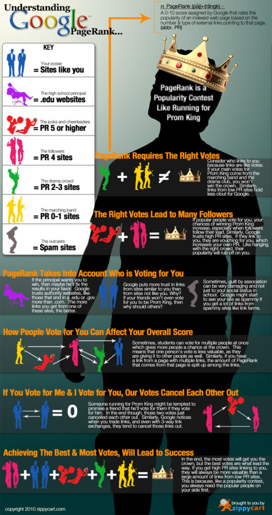
This infographic from 2010 deals with the complex issue of Google page rank. There’s a lot of text, which isn’t really desirable in an infographic – since an infographic is essentially about the graphical presentation of information. However, it is useful enough to read on. And certainly it is a more graphical way of presenting the information that it otherwise might be.
8. More is More
You’d have to assume that a company whose business is in the graphical representation of information would be good at infographics. This industrial automation and real-time data business shows that even really complex topics and systems can be broken down into really legible graphics.
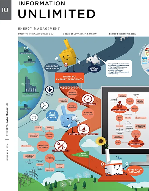
Why we love it? It shows that infographics can work really well for B2B too.
9. Choose a Catchy Title
And live up to it.
Why we love it? It’s good to have ambition.
10. Incorporate Real-Time Data and Video
This stunning infographic created for the Guardian uses live data to construct its map of global air flight in the last 24 hours. Broken into four sections: interactive map, video history, voiced timeline and future state and problem analysis, it lifts the humble infographic to new heights.
Why we love it? What’s not to love?
Want to create your own?
The best software for creating infographics like these is still Adobe Illustrator. We run Introduction to Adobe Illustrator courses regularly – check out our courses here.
Want More?
If you just can’t get enough infographic inspiration, you might want to sign up to this service that sends you a new infographic to enjoy on a daily basis.
We definitely recommend the information is beautiful site.